University of Queensland Student Services Information Architecture
Developing a more intuitive website information architecture
Project Overview
- Client: University of Queensland
The University of Queensland’s Student Services was developing a new website to make finding support more intuitive for students. I helped them develop a new website information architecture based on students’ behaviours and cognitive models.
My Role
- I played the lead role, which included project and stakeholder management, research methods planning and execution, research analysis and writing the final technical report.
Objective
The University of Queensland was rewriting and migrating content from the current Student Services website to the new my.UQ website. The old website had known issues with students finding information and there was low utilisation of the online resource. Student Services wanted to make their new site more intuitive and valued by students and they wanted the new information architecture (IA) to reflect student needs.
Research
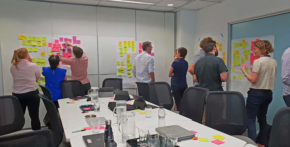
To develop a new information architecture for the new UQ Student Services website, I worked closely with the stakeholders in workshops to gather requirements. Then, I designed a mixed-methods research framework to ensure a representative sample of students were engaged and final design decisions could be backed with robust reasoning. Research activities included:
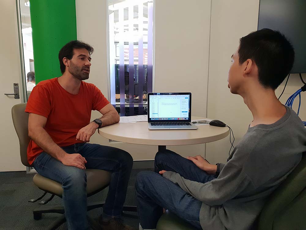
1. Contextual Interviews captured student behaviours seeking assistance at University and online. The interview also uncovered issues with the current website by getting the students to role-play scenarios when they might need information.
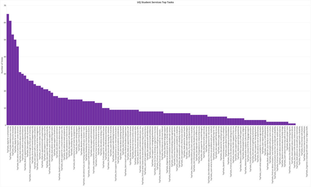
2. A Top Tasks Survey identified the most valued assistance at Student Services. Discovering what “top tasks” students were trying to achieve informed where Quicklinks would need to be situated in the website.
The left of the graph represents the most sought after services, while the right of the graph represents the least.
Read Top Tasks creator, Gerry McGovern’s Medium article about the methodology.
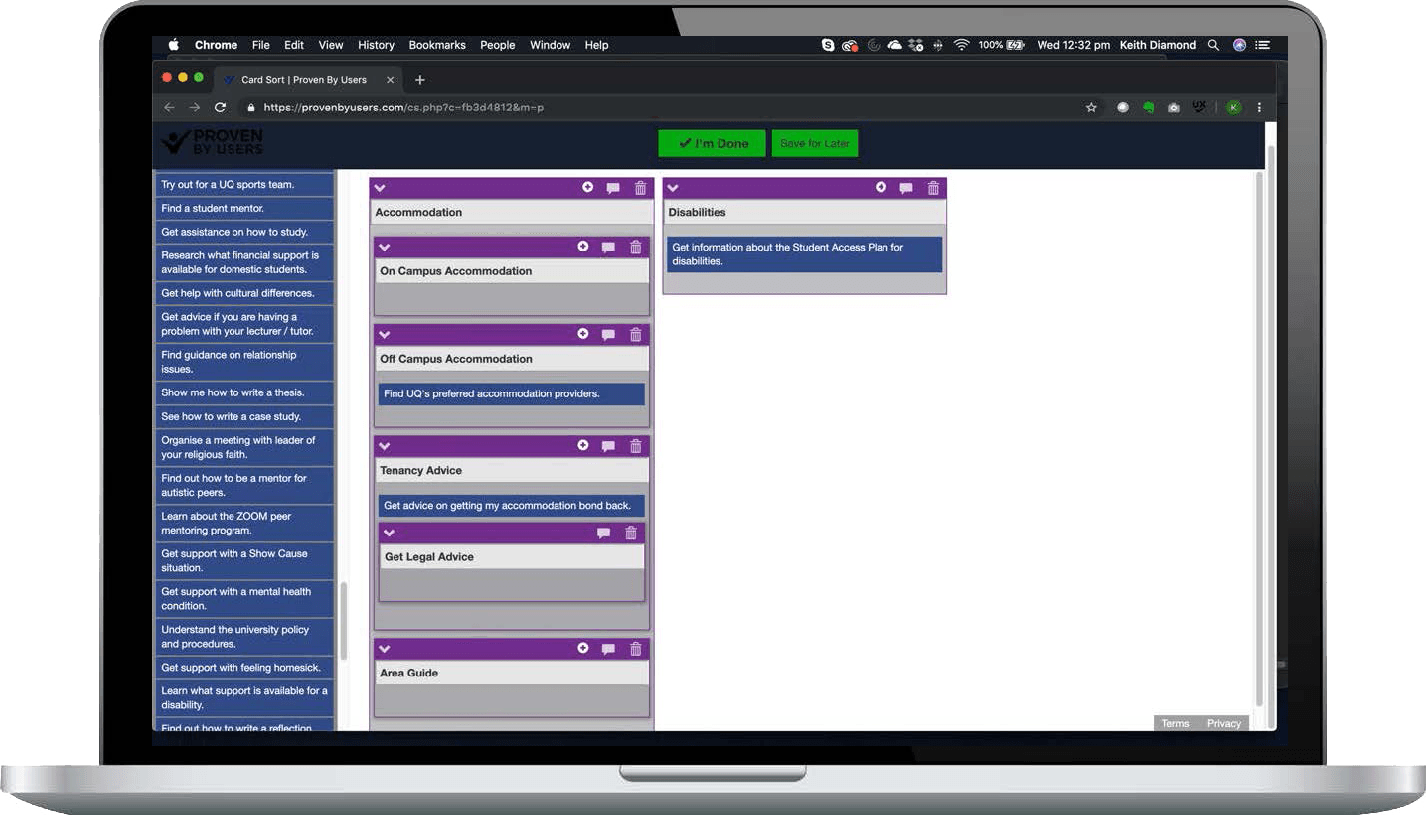
3. Open Card Sorting sessions collected data to establish cognitive models of how each student categorised information and the language they associated with the groupings they created. Each card represented a piece of information they could find on the university student service’s website.
Analysis
Qualitative and quantitative research data was processed and analysed. Contextual qualitative data defined student behavioural qualities the website information architecture needed to consider.
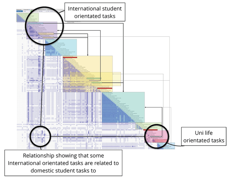
The card sorting software produced quantitative data that could then be analysed. The analysis defined the major categories to which most of the content should be grouped.
The analysis also validated some of the qualitative insights picked up from the interviews. For example, in the interviews, both international and domestic students needed the same information to settle into a new city and life, but the information on the old website segmented these two student groups. After careful analysis, there was amble support to remove the domestic-international segmentation and create a more inclusive ‘Settling In’ area of the website.
Outcomes
With a project that had many university stakeholders across departments involved in decision-making, it was important to deliver a result that had the research evidence to support decisions. The research approach provided solid logic which helped make tough inter-department decisions much easier.
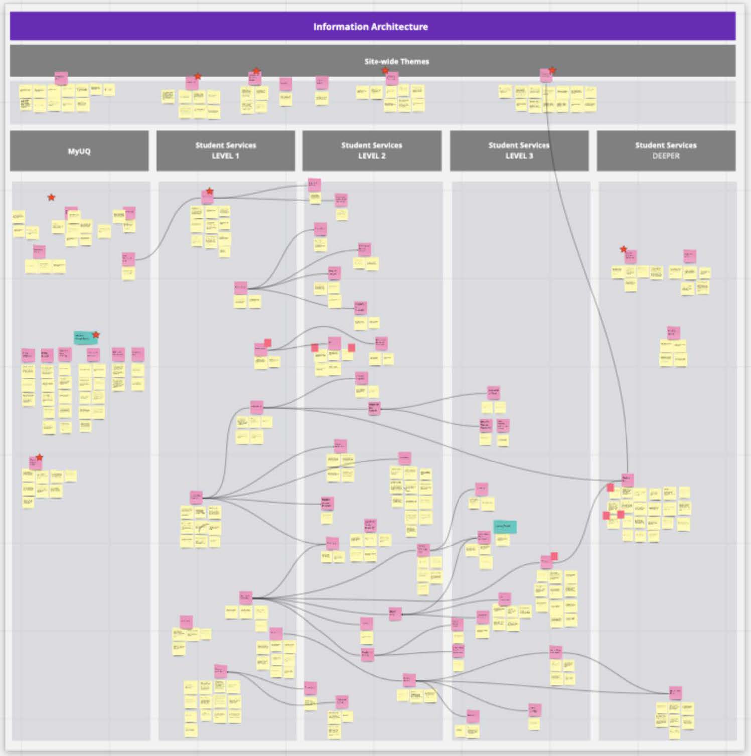
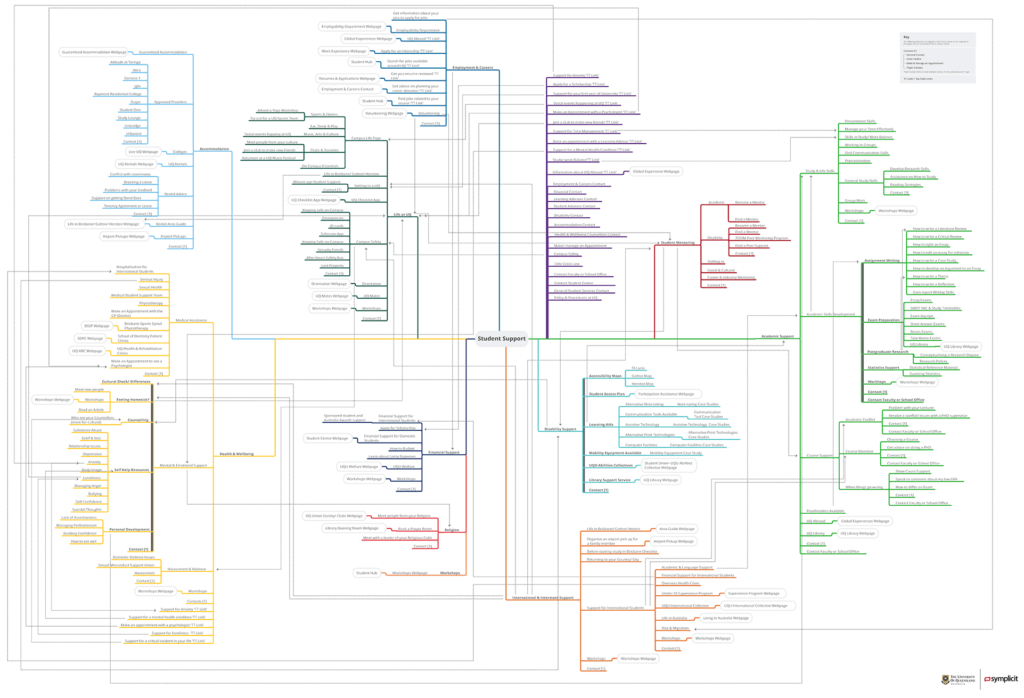
Research outcomes produced a new my.UQ website information architecture that incorporated better categorisations of services that were cross-linked, reflecting the importance of the relationships between services and the students’ searching behaviours.
For example, the lighter grey lines in the final artefact visualise cross-links that support the behavioural use of the Google search engine which sends students deep into the website. The cross-links enable students to navigate laterally instead of being forced up the website hierarchy.
